Dropout Search Improvement
Maintaining learnability and visual brand identity while improving the user experience
As part of a theoretical design project, I embarked on a project to redesign the search feature for Dropout, the subscription streaming service known for its original programming on Dropout.tv.
The goal was to create a more intuitive and efficient way for users to discover both new and classic content without having to scroll endlessly through the entire catalog. I wanted to make it easier for users to uncover hidden gems and access their favorite shows with ease.
The Dropout iOS app lacked several navigation features commonly found in other streaming or video services - but which one was the right choice to add or alter?
A Comedy Gold Mine
Dropout, the popular streaming service, was born out of CollegeHumor (a comedy website covering topics such as pop culture, internet culture, and college life). Their content includes the popular TTRPG actual-play show “Dimension 20”, the trivia show “Um, Actually”, and the variety game show “Game Changer”.
On the fifth anniversary of the streaming platform, 4 months before I started this project, CEO Sam Reich (that bearded guy to the left) announced that CollegeHumor would be fully rebranding to “Dropout”. He also announced a large number of new shows (nearly a 50% increase in active titles).
Sam Reich always has a lot to say about the future of the business he champions (on Dropout, in interviews, and on his popular TikTok page). So a lot of my initial research explored his statements and the history of the brand, as I began to identify the feature change or addition that could be implemented to enhance content navigation most efficiently.
Since Dropout is growing, I started my research by exploring some similar businesses with substantial catalogues, and compiling some takeaways.
Broadway HD
A streaming service for filmed stage recordings of classic musicals and plays.
Major Takeaway: Offering multiple clear categories of continually released content helps users to feel that they are making a cost-effective purchase, improving both user satisfaction and user retention.
The “grandfather” subscription streaming service that distributes original and acquired films and tv in a wide variety of genres and structures.
Netflix
Major Takeaway: Organizing results by popularity helps speed up the average user, but can bury more niche content, preventing discovery of less frequently accessed material.
A multi-platform entertainment company that is headlined by a TTRPG actual-play show.
Critical Role Productions
Major Takeaway: Users feel connected to the company founders and individual performers, and often want to find and watch content specifically featuring their favorites.
Okay, so I confirmed that offering clear categories and sorting by performer is helpful, and sorting by popularity has mixed results. What’s next?

Time for some user testing!
With a grounding in background research and comparative data, I moved into user interviews and concurrent user tests with five individuals meeting this criteria:
Is a Dropout monthly subscriber (one of our business’s stated goals is converting monthly subscribers into annual ones, so we focused on the experience of monthly subscribers, as that is the experience we’re most focused on for this project)
Has been subscribed for more than 6 months (long enough to have a good understanding of the existing information architecture of the navigation system)
Uses the Dropout IOs at least once a week
This series of testing focused on prompting users to attempt to locate specific videos (or a type of video) and analyzing their process, when they were frustrated, and where they wanted a different option.
These interviews and tests revealed lots of opportunities - but 3 big trends emerged.
It's difficult to navigate the search results with only one available filter - users desire more refinement in the search process.
Users frequently make decisions on what content to watch based on the performers featured (this supported our previous observation)
The existing “tag system” for navigating through videos is under-utilized by users, and does not support effective user interaction.
So what’s the best avenue for improvement?
Based on our research, I decided to develop a strategy for allowing users to filter search results, with a focus on filtering by performer, because our user’s experience was being negatively impacted by the difficulty of navigating the search results.

Meet Dakota
Dakota is our user persona - she’s a reference point we can return to when I am trying to make a decision and want to focus on what will best benefit the user - but what would Dakota do?
This tool is a part of the most important part of my design process - prioritizing the voice of the user. While not every project needs a persona, every project needs a designer who will advocate for the voice of the people who aren’t in the room, and that’s something I really treasure.
So now we know what problem we’re trying to solve, the approach we’re going to take, and who we are designing for.
It’s time for that critical moment - a foundational “How might we” question! I used this question as a guiding principle to streamline the project, constantly assessing whether the choice we were making was the best answer to:
How might we allow and encourage users to filter search results in the Dropout IOs app in order to improve user experience while searching for content, whether that content is new, older, niche, or popular?

To answer that question, I need to explore the value of each potential solution
I analyze and organize features through a rating system I designed myself that helps me to be as strict and firm as I am with prioritization.
On a scale of 1 to 5, all features receive a rating on their relevance to our business goal, relevance to our user goal, and the cost of implementation. The features are then scored through the equation, prioritizing the highest value features.
Let’s use this tool to compare two potential features I considered that would both allow users to filter the results of their search, reducing scroll time, to improve the user experience.
Feature 1 : an “exclude keywords” feature that would allow users to exclude videos and shows tagged with specific keywords, or with those words in the title or description.
User Value: 4/5 (Beneficial to user goals) Excluding keywords would be beneficial to our described user goal of decreasing scroll time and inspiring confidence by putting control in the hands of the user, but is not entirely necessary to meet user goals.
Business Value: 2/5 (Adjacent to goals) One of our described business goals is to encourage users explore the impressive variety of content on the app, but this feature runs the risk of reducing user discovery. It receives a 2/5 instead of a 1/5 (unrelated to business goal), as our business goal includes an improved user retention (which is based on user experience).
Cost of Implementation: 4/5 (High Cost) While the existing tag system could be used as a foundation for this feature, it is likely that an overhaul of the tag system would be necessary for this feature to be effective for user success.
Formula Total:
User Value + Business Value - Cost = Value
(4 + 2 ) - 4 = final value of 2
Feature 2 : a length-based filter feature that allows users to limit search results based on the run time of a video or the average run time on a show.
User Value: 4/5 (Beneficial to user goals) Because the Dropout catalogue varies wildly in length (from less than minutes to multiple hours), this feature would be quite beneficial to the user goals of decreasing scroll time and improving user confidence.
Business Value: 4/5 (Beneficial to goals) Unlike the exclude keywords feature, this feature does not pose a substantial risk of preventing users from discovering a general category of content, but it does support the business goal of improved retention based on user experience, as this tool reduces scroll time, improving the overall user experience.
Cost of Implementation: 2/5 (Low Cost) Implementing this feature will require tagging each video with their length and identifying the average length of each show, but will not require an overhaul of the tag system or digging into the content of individual videos.
Formula Total:
User Value + Business Value - Cost = Value
(4 + 4 ) - 2 = final value of 6
Since the “exclude keyword” feature only has a value of 2, I considered it a “nice to have” feature (implemented only if we have an abundance of available resources or on a future release). Since the length-based feature has a high value of 6, I selected it to be one of our core MVP features.
Our four core features, at the end of my value calculations, were:
A length-based filter feature
A release date-based filter feature
A featured performer-based filter feature
A “sort-by” feature for organizing search results.
So, how do I maintain brand identity and learnability for existing users, while making these changes?
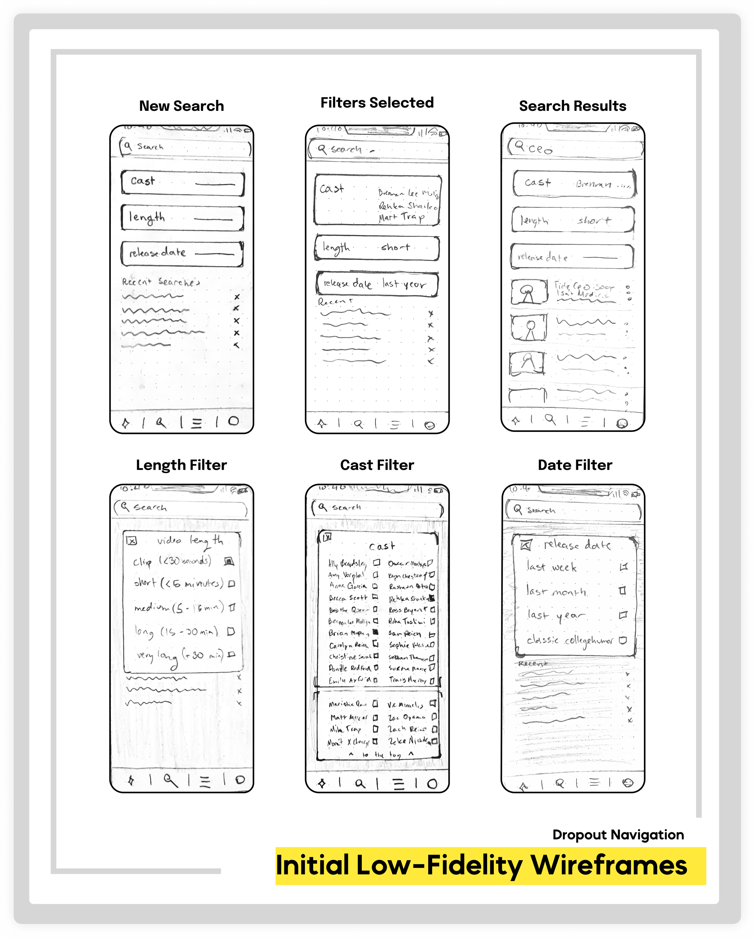
Once I had identified the most necessary and effective features, I began to sketch out potential solutions. I really wanted to prioritize learnability - our users are already familiar with the basic Dropout search function, so any changes we made needed to be within the visual rhythm already present on the page.
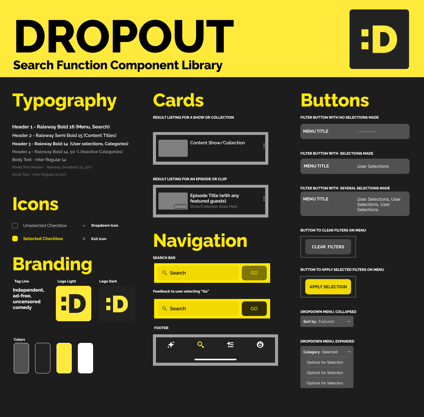
The most important tool for maintaining brand identity as I digitized my wireframes was the Component Library I developed.
This library allowed me to maintain consistency, sped up the design process, and improved my flexibility, as I was able to customize items from the library while still adhering to the brand identity.
After digitizing my initial sketches, I developed a set of Mid-fidelity wireframes, utilizing the component library for efficiency and consistency.

Let’s test it!
At was at this stage that I entered my second round of user testing. I created a flowchart with all of our existing screens for participants to navigate during this test. The goal at this stage was to determine if the participants found the site familiar and usable without significant error, and to gauge general user reaction to the filters.
For example, I discovered during this testing phase that users were more likely to search based on the release date of a piece of content than on the length of that content, so, I re-ordered the sequence of the filters to prioritize sorting by release date. These sorts of detail-focused decisions are a core part of my design philosophy - every little change makes a huge difference to users.
With these final touches underway, the next step was to upgrade to high-fidelity wireframes, and link it all together into a functioning prototype!
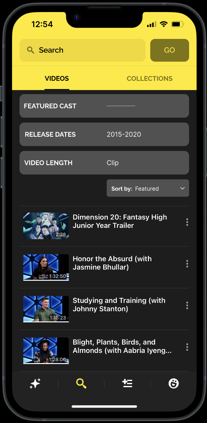
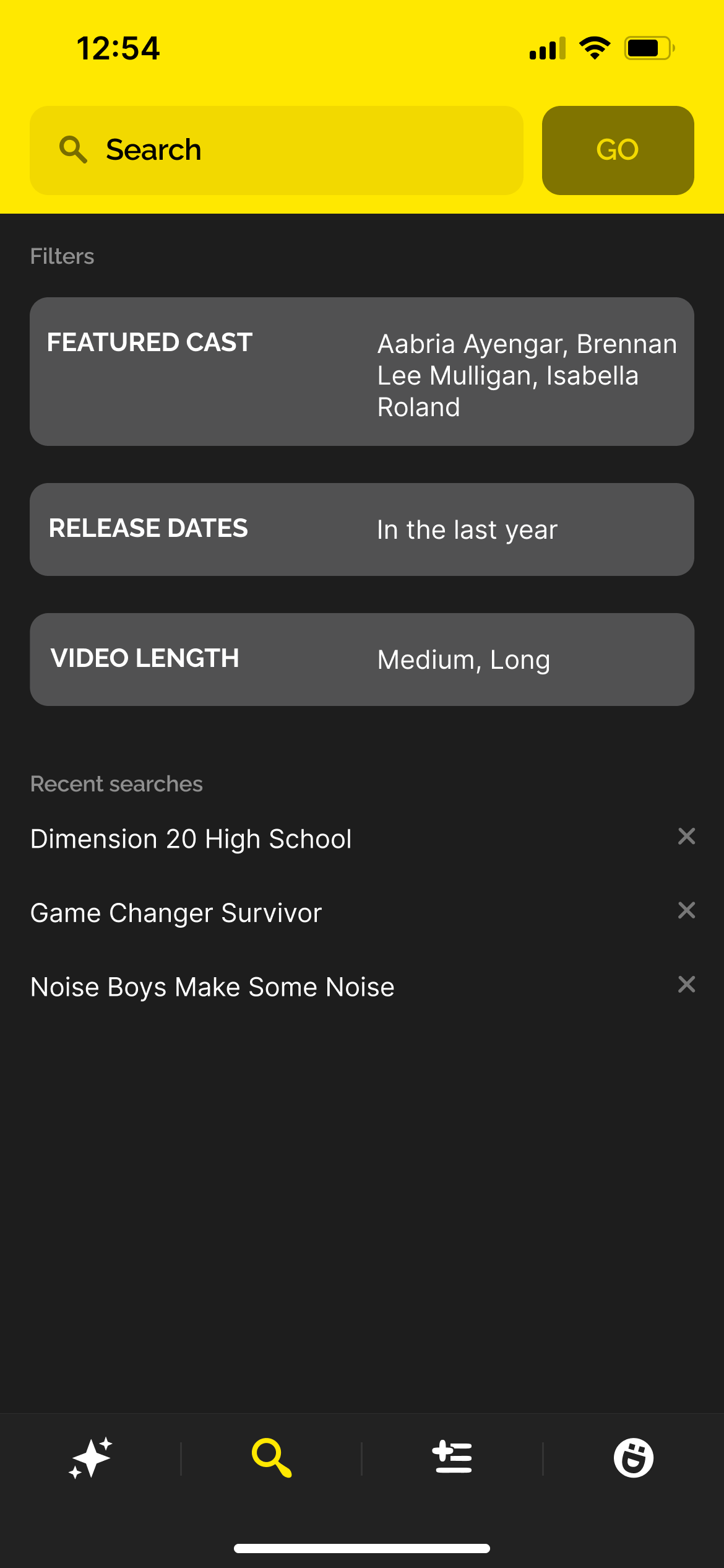
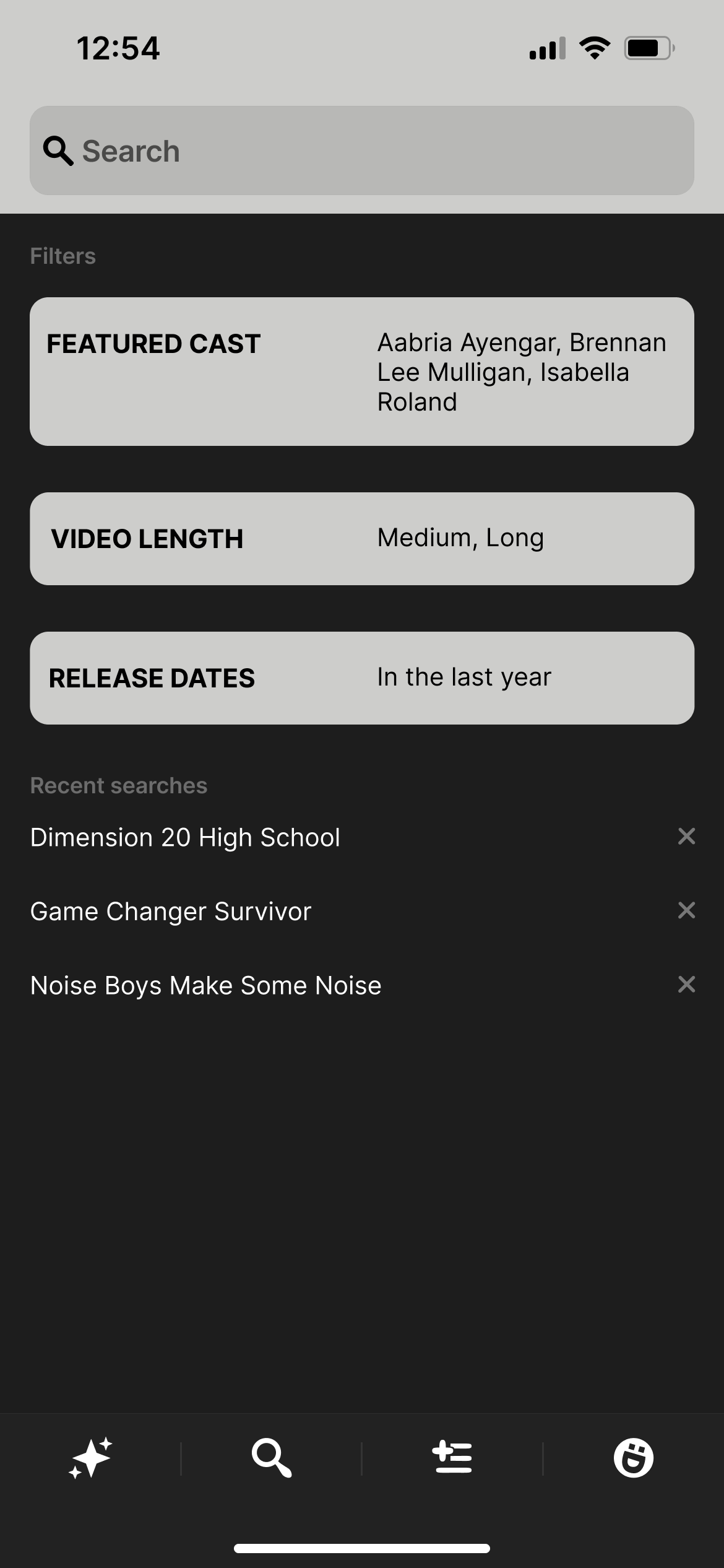
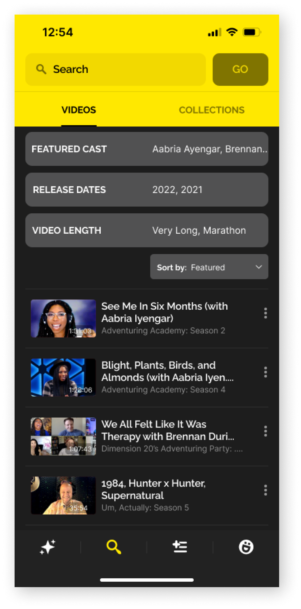
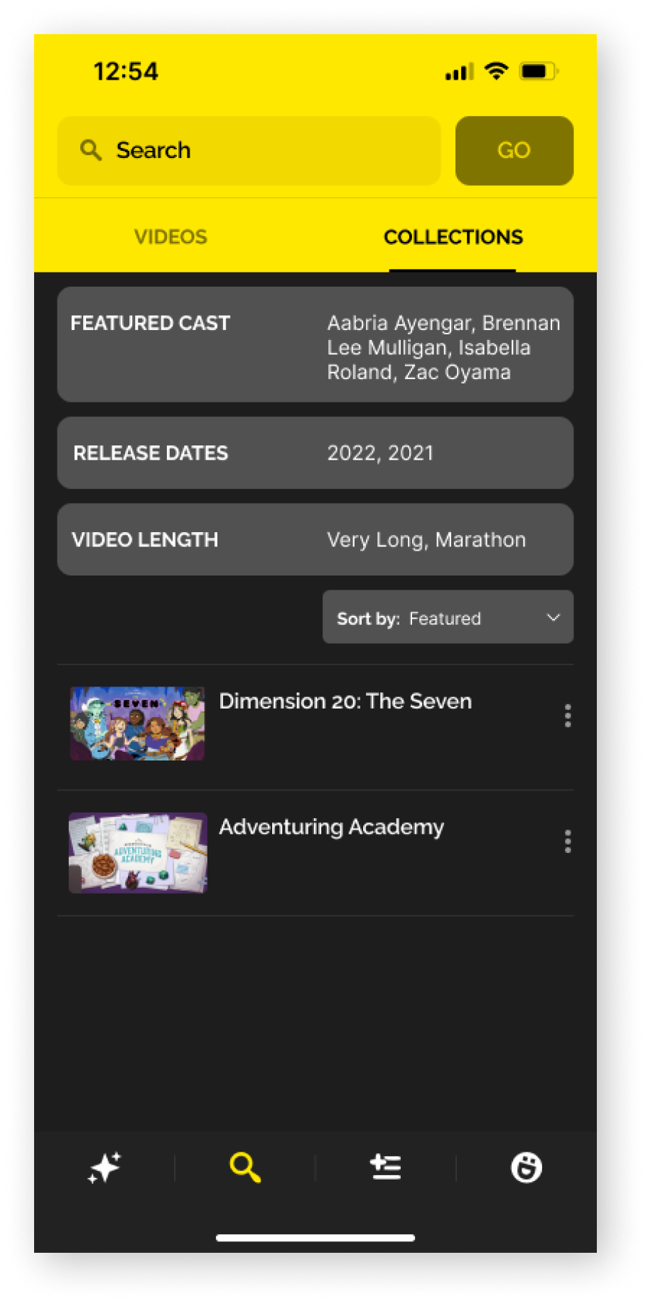
Filter Your Results: Cast, Length, and Release Date
No more scrolling through every result related to your search term. Too many results? Filter them!
Without changing the base features of the search function, these changes dramatically improve a user’s ability to discover content in the catalog.
Popup Menus simplify navigation in the search
The goal is to minimize the scroll - so instead of pages of options, we provided 3 pop-up filter menus that can be opened to make selections.
Streamlined Buttons to reduce visual distraction & make change optional
Change isn’t for everyone! By keeping our menus collapsed and not requiring filter use to search, we can improve overall user experience without requiring extra work from users.

Next Steps?
With the implementation of this filter feature, I would strongly recommend collecting data on the ongoing and specific usage of each of these filters in order to ensure they are meeting and continue to meet user needs. Specifically, to discover:
How many filters are used in the average search?
What filters are used the most often? Is there value in creating smaller divisions to reduce scroll time within those filters?
Are there any settings on the filters that are rarely/never used, and could be eliminated?
My biggest project takeaway:
Sometimes, you can do the most by changing the least.
When initially looking into potential features to enhance content navigation, there were plenty of complex and extensive options that would have met our user and business goals - many of which were within the scope of this project. However, by selecting a narrow feature and maximizing the potential of that feature, I was able to fully explore the best and most effective way to improve the product without wasted time or effort.


