IzMoze - Booking Site and Store
Creating visual legitimacy and function while maintaining the existing artist-client intimacy
When the opportunity to work with a queer, disabled local artist from Chicago came up, I jumped at the chance to help Iz build a booking site, portfolio, and store. The project aimed to shift the artist’s client interactions from social media to their own website, helping them establish a stronger sense of legitimacy and streamline the booking process.
Iz is a remarkable artist with a unique vision and a passion for people - this is the story of trying to capture that vision in a bottle.
Designing for a Dreamer
Iz Mozer (they/them), a queer, disabled artist from Chicago, works in several disciplines, including sculptural painting, portraiture, and tattooing, emphasizing hand-drawn designs and trauma-informed practices. As online algorithms shifted, they found that their previously very successful social media presence was no longer driving the engagement and bookings that they’d previously enjoyed.
Understanding the challenges Iz, as an independent tattoo artist, might face in hiring or affording a UX designer, I saw an opportunity for collaboration and reached out. Their immediate goal was to launch a website for client interaction and to expand merchandise sales. Long-term, they aimed to establish a trauma-informed tattoo studio doubling as a community space for art and events, so it was important for their website to provide a sense of legitimacy moving forward in their career.
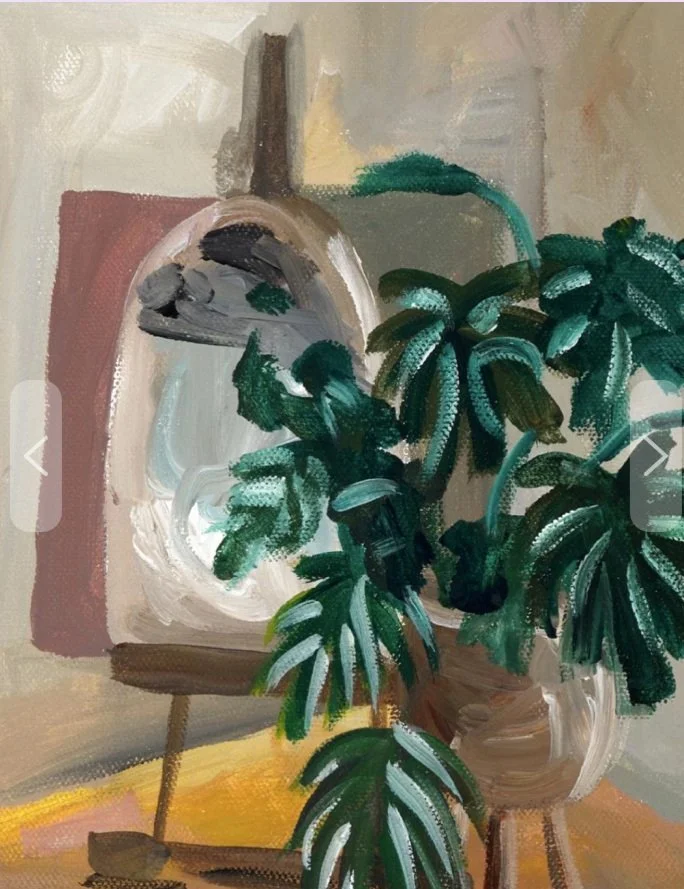
Art: Portraits 2 by Iz Moze
Did I mention it needed to be done in two weeks?
With this seriously short timeline, I immediately reached out to my contacts and began to build a participant group for user interviews based on criteria founded on our target demographic. These interviews were to be 30-60 minutes in length, recency-driven, and experience-focused.
I decided to utilize Semi-structured Generative User Interviews as our primary method of gathering user information at this stage. Since we were early in the process, I needed to know what I didn’t know just as much as I wanted my questions answered. The semi-structured scripting helped to elicit deep user insights, by drawing participants into sharing the narrative of their experiences, rather than simply answering questions.
Making the Data Digestible
We grouped each insight under a memorable tagline based on the research question it related to, or the shared topic if the insight was related to a new question posed by the generative interview style. These memorable taglines were a vital part of communicating with our primary stakeholder (the artist), who didn’t have extensive experience with UX research and didn’t want to be overwhelmed by data. Some of these insights included:
“If it doesn’t fit in their hand, it doesn’t fit in their life.”
“We’re here, we’re queer, and honestly sincere.”
“If you’re great, clients will wait - but not to hear from you.”
“Organization is the key to staging art with variety.”
“Start with the site, and the future is in sight.”
First up - what’s our design goal?
With all of these elements assembled, I identified our design goal - our guiding central problem that I could return to any time I needed clarity about a design aspect:
Let’s explore ways to create a connection between users and the artist based on shared community and trust, because our user’s main story is about identifying with an artist that they want to patronize and communicating with them to book, commission, or make a purchase.
With the design goal identified, I had one more support to lean on when making ongoing decisions - a “how might we” question.
How might we create a connection between users and the artist while building an easy-to-use and transparent website in order to increase inquiry rate, conversion of inquiries to bookings, and sales of physical work?

But what should we build?
Before moving into flows and wireframes, I needed to establish exactly what features were within the scope of our remaining timeline. I have my own formula through which I ruthlessly prioritize and strip down MVPs to ensure a robust but manageable project. Each feature is rated from 1 to 5 on its relevance to our business goals, user goals, and implementation cost. These ratings are then combined into a final score between 0 and 10, which determines their ranking. For more details on the formula, check out this case study. Here’s the simple version:
With this prioritization method in mind, I began to build out the information architecture structure. When approaching the preliminary site map, I leaned on the navigational structure I identified with comparative analysis of similar sties and services - a hamburger menu with a large typeface list of broad categories, with the knowledge that the site map would likely grow and change through the flow creation process.
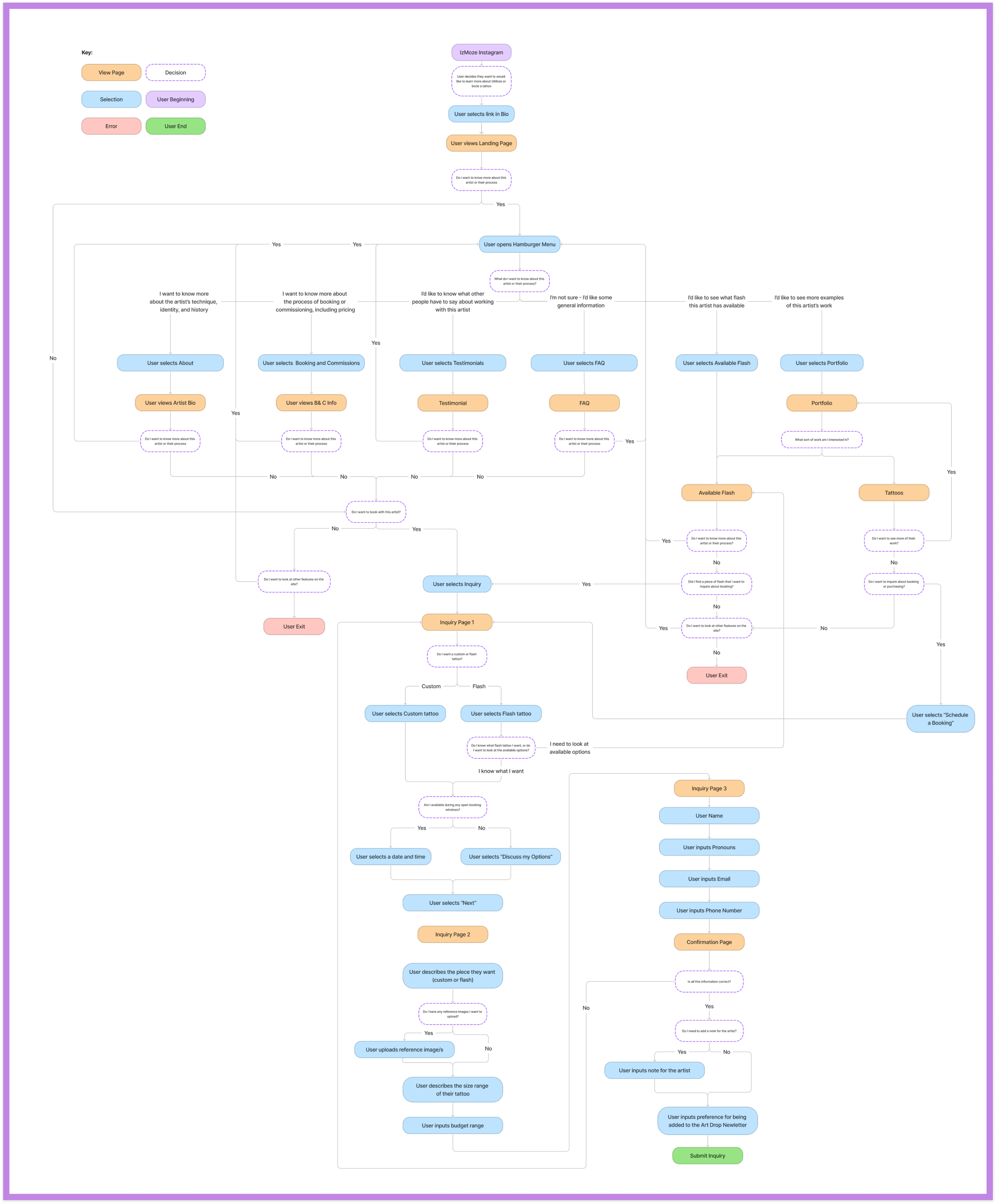
I elected to map two major flows based on the two primary tasks we expect a user to perform on the site, and also required inclusion of the vast majority of the features in our prioritization table. Our research revealed that one of the main motivations for users booking with or commissioning an artist was what users know about the artist (remember: We’re queer, we’re here, and we’re honestly sincere). So our user flows reflect the likelihood that a user will want to explore and learn about the artist as part of the process of booking.
Here’s one of those major flows - this one is focused on the user’s journey that starts on the artist’s Instagram, and ends by submitting a booking inquiry.
Time to put the plans in place
With my thorough understanding of the project goals, user needs, and functional requirements, I moved to sketching rough layouts of the user interface. These low-fidelity wireframes focused on capturing the basic structure and functionality of the interface without getting bogged down in details. After a quick review of the low-fidelity wireframes with my primary stakeholder and mentor, I moved on to creating mid-fidelity prototypes that incorporated more detailed design elements.
Despite the tight two-week timeline (and, at this point in the process, 3-days left), I felt it was really important to pause and implement a user-testing phase at this point.
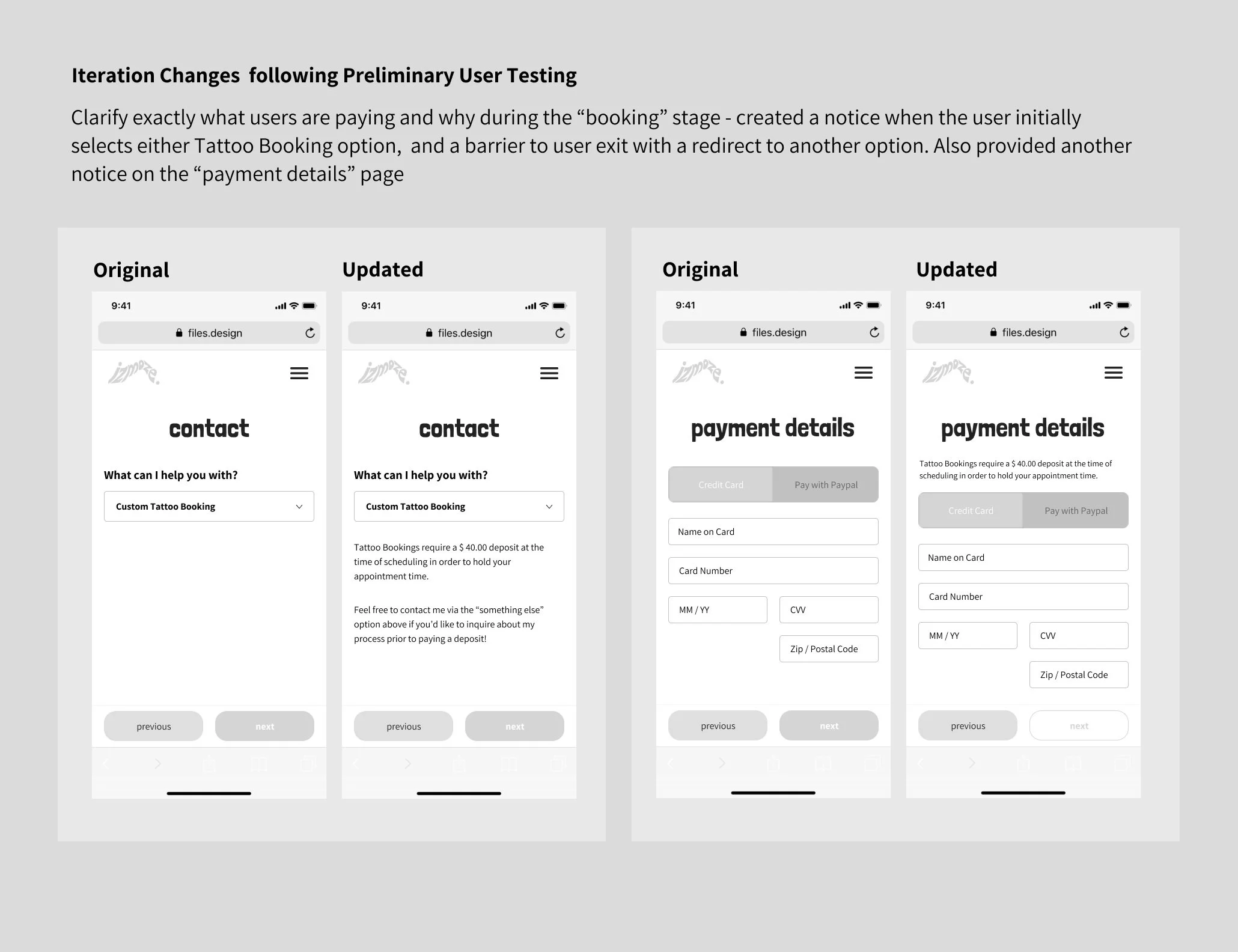
These mid-fidelity prototypes were the basis for our preliminary user testing. At this early phase, the wireframes were not linked into a digital prototype, so after the in-person participants made decisions with our wireframes, I navigated them to the next appropriate screen manually. The feedback from these tests led to several changes that made a big difference to the user experience - here’s an example.
With these updates in place, I was ready to move into high-fidelity for the next iteration of the project.

With the transition in high-fidelity complete, I began work on a plan for my usability tests - a series of generative questions, followed by prescriptive tasks. For example, we asked users “How would you go about finding a print that you wanted to purchase from the site?” in order to observe their journey through the process of purchasing a print from discovery to confirmation. This task would help us discover if participants would able to use the shop feature from discovery to purchase confirmation without error, and if there were opportunities to reduce the number of steps involved to streamline to shopping experience.
Based on these user tests and feedback, I made several changes -
I added a “book with me” button to bottom of the Pricing page - users want to go directly from the page explaining the cost to booking.
I re-titled pricing page - users were confused by the the existing titles.
I added “back” button to “you’re all signed up” - users wanted to return to their previous page, not just return home.
And many more - most changes were small, but added up to a significant improvement in user experience.
All that was left was to make these minor changes and link all 70 screens together into a functioning prototype!
Booking with Consideration
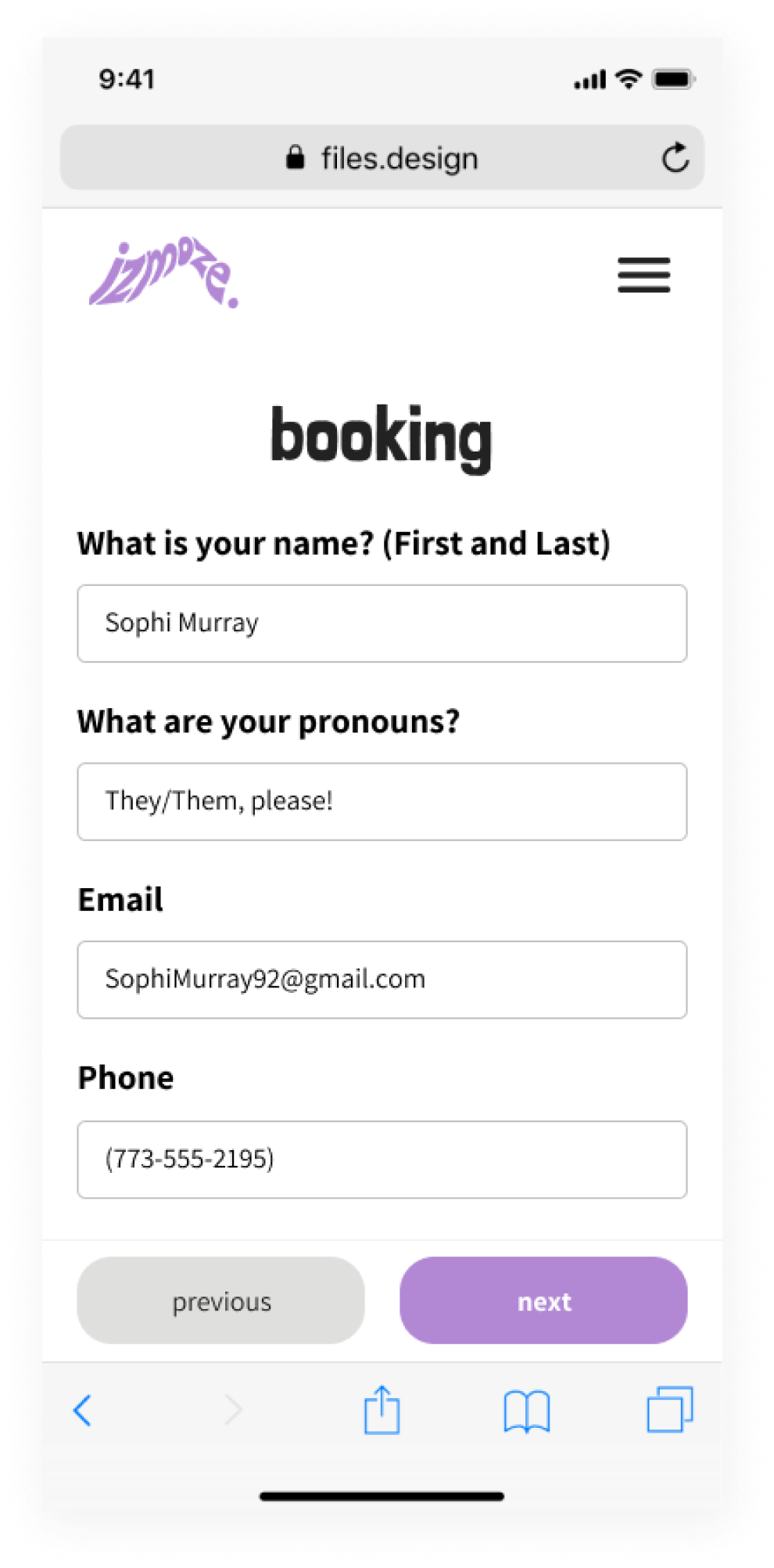
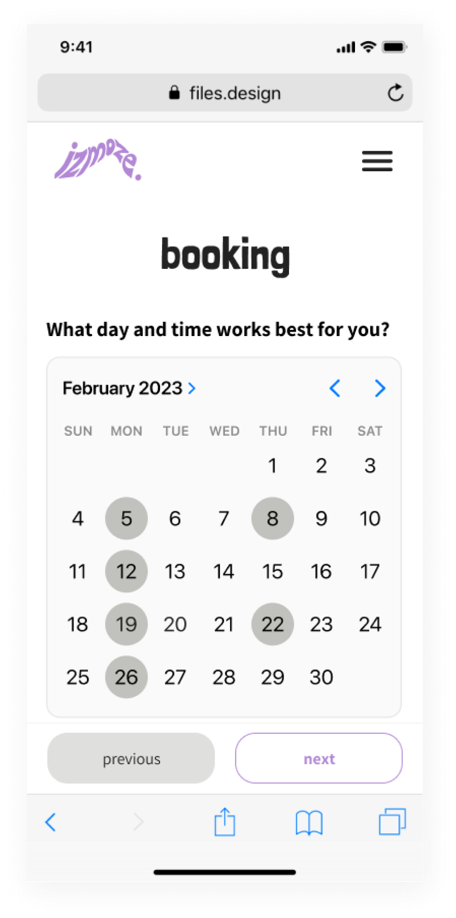
By utilizing question-based prompts instead of exclusively single word prompts, and considering for user’s identity, we help to build an approachable form that drives users forward through the booking process.
Simple Steps to Create Connection
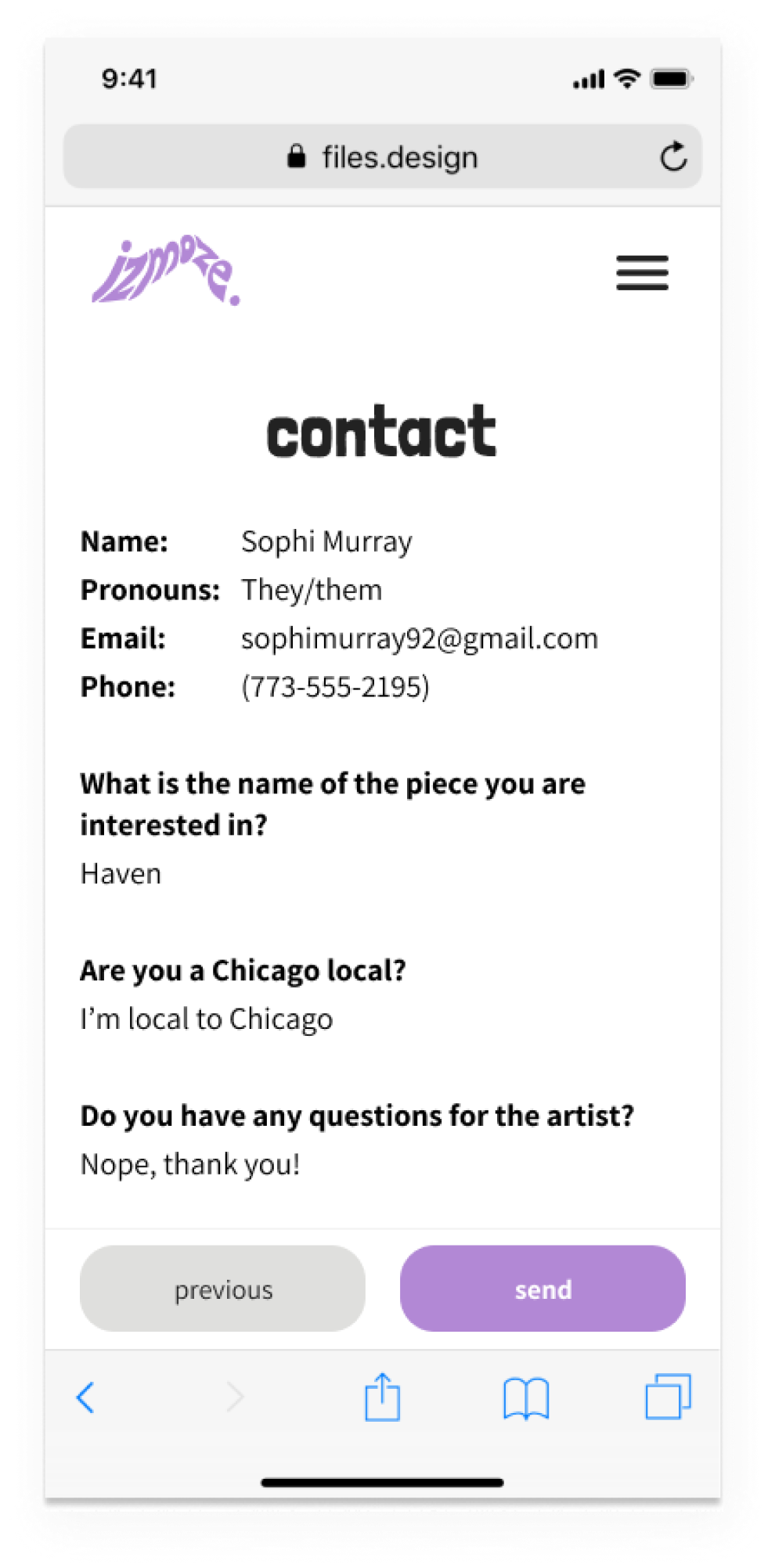
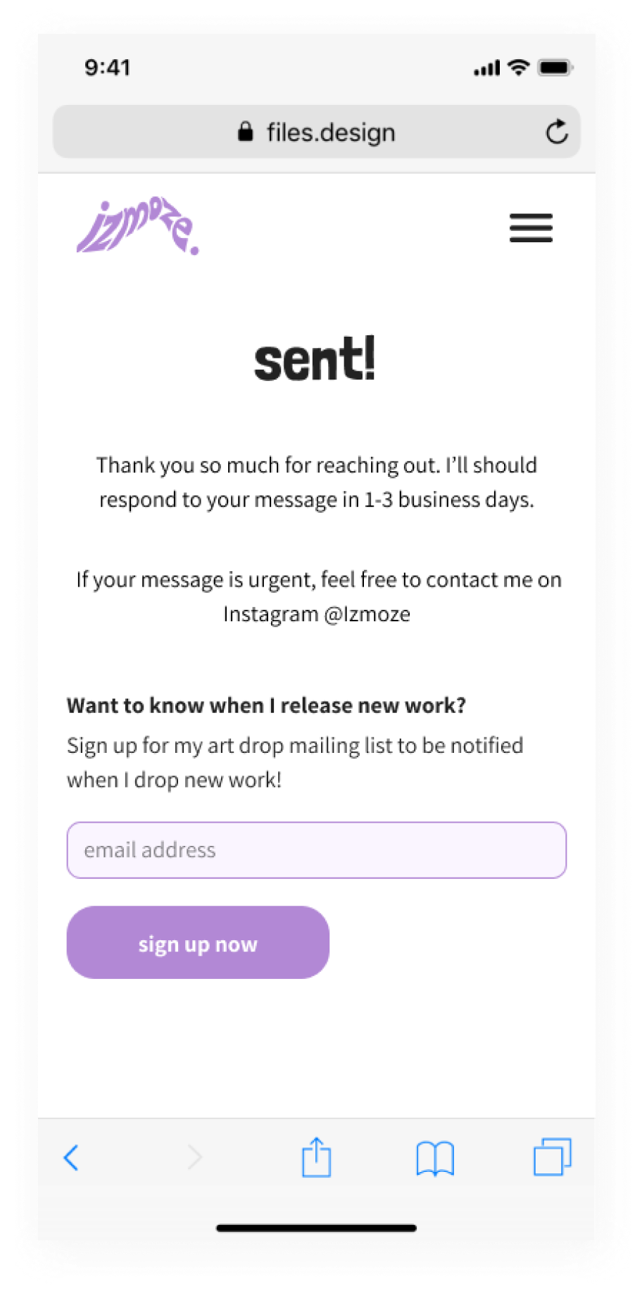
Building a user’s confidence and connection to the artist with clarity and simple contact forms helps to grow and maintain the vital artist-client intimacy we set out to keep.
Building additional income streams
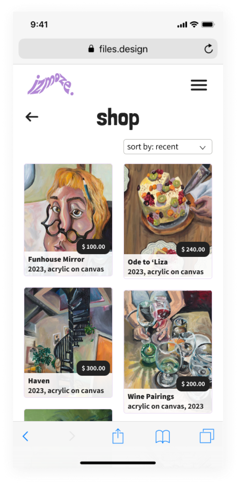
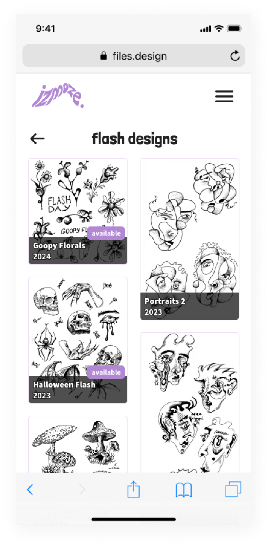
With a masonry format, our artist is able to display their available pieces and build the foundation for future income streams.

Next Steps?
While this site and the artist’s portfolio continues to grow, the primary next step I have recommended to them is to always return to the short taglines we developed to maintain their brand and product goals. Artists grow and change, and this site will also need to grow with the artist, and by maintaining those core concepts, next steps will fall in line with the core of the product’s design.
In terms of feedback, I’d recommend surveying guests at the end of their experience on the booking experience, from first discovery to process end, to identify any snags or potential roadblocks in the user journey.
Future features that could be worked into the site include a shop tour, gallery of previous tattoos in various stages of healing, and safety instructions for tattoo aftercare!
My biggest project takeaway:
Embracing constraints is key to effective design
When facing constraints like a short timeline, limited resources, and varying user needs, the best way to erase constraints is to embrace constraints. Instead of seeing them as roadblocks, I used them to my advantage to create a concise, encompassing product that fulfills the needs of our users by reducing bloat and developing solutions that were both efficient and effective. Navigating within these constraints allowed me to fine-tune the user experience, trim the excess, and create something that users truly connect with. So, in the end, constraints weren't obstacles—they were the fuel that drove me to deliver a top-notch product that exceeded expectations.


